Examples
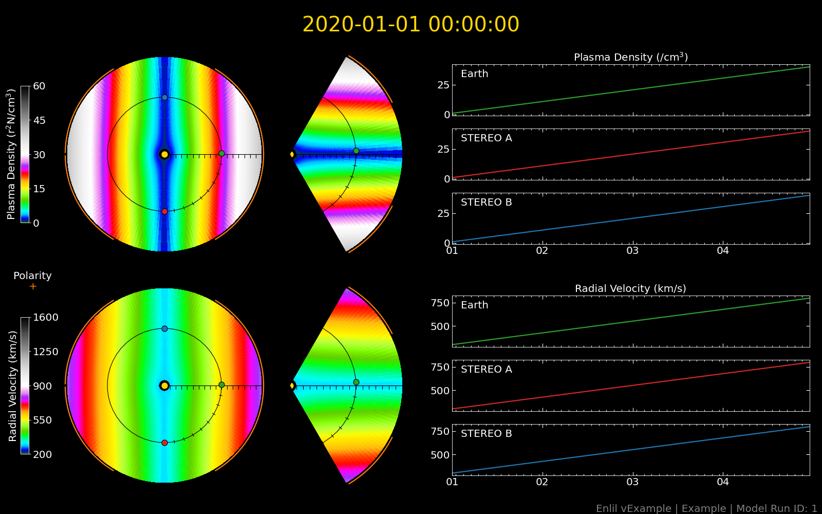
Forecaster Plot
Historically, a space weather forecasting office uses a predefined figure layout to represent the density and velocity on several two dimensional slices and also a time-series of the data at several satellite locations. To maintain the same look and feel of the current forecasting offices we have implemented a similar look and feel with just a few simple commands.
import matplotlib.pyplot as plt import enlilviz as ev import enlilviz.plotting as evplot enlil_run = ev.io.load_example() forecaster_plot = evplot.ForecasterPlot(enlil_run) plt.show()(Source code, png)
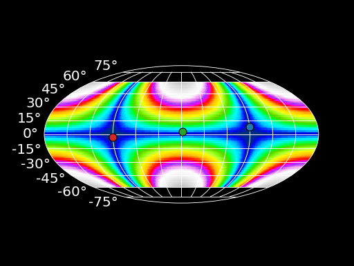
Radial Slice
The datasets output from Enlil also contain a radial slice that is often neglected. These can easily be incorporated into a user’s workflow as well.
import matplotlib.pyplot as plt import enlilviz as ev import enlilviz.plotting as evplot enlil_run = ev.io.load_example() radial_slice = evplot.RadialSlice(enlil_run, 'den') plt.show()(Source code, png)
